What does it mean to design for 1.9 billion people? This is the question that we must face when taking on the challenge to redesign Facebook.
Many of Facebook’s business decisions often dictate future trends in digital products.
Consider the current emphasis that Facebook is putting on Messenger and how this is being reflected in other products around the world.
Redesigning Facebook is a massive opportunity for a designer. It’s so much more than just testing a new color palette. A redesign of this size allows a designer to have an impact on the future of digital design because Facebook is such an influential product.
Facebook is a popular product for designers to take on because almost everyone knows the interface. That being said, its popularity also makes redesigns controversial within the design community because everyone has their own opinions on how it should be. Below is an array of Facebook redesigns from some of the world’s best designers to inspire you to take on the challenge as well. Yes, you read that right – we want to see your designs too.
We’re giving designers two weeks to redesign some aspect of Facebook. One winner will receive a Dribbble invite, a Toptal t-shirt, and $200 in credits to Creative Market. We will announce the winner on Friday, Dec, 2. If you would like to enter, leave your submission in the comments.
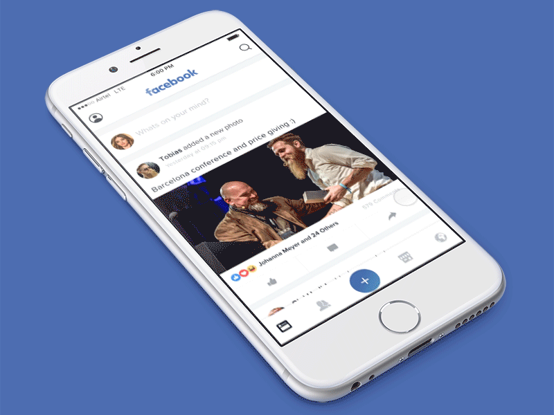
Newsfeed and Messenger

Credit: Eyal Zuri
Zuri makes a bold proposition to remove Facebook ads and makes his redesign on messenger. As a result of Zuri’s large following, the redesign sparked much debate on Dribbble. The online community suggested that to remove the ads is unrealistic. However, Facebook ads are now inline with much of the content, so Zuri’s proposal could be legitimate. Also, it’s common knowledge now that Messenger is the focus of Facebook’s business. Zuri’s redesign gives less visual weight to the notification area, proposes some drop shadows, and rounds many of the inputs.
Mobile Profile
Credit: Diana Malewicz
What if the Facebook UI went round? This redesign explores that simple question and cleans up the user profile in the process. The current Facebook mobile profile lacks any visual balance or hierarchy. Diana’s concept changes that. Even the simple center align effectively organizes the content, whereas Facebook’s mobile version seems to lack any vertical justification.
Mobile UX
Credit: Manoj
A single point for interaction proposes a refined user experience for the Facebook mobile app. Just one tap on the plus icon, and you can update your status, check in to your location, or start live streaming. Manoj also adds a Marketplace tab on the bottom navigation to allow for buying and selling on Facebook.
Profile and Messenger

Credit: uixNinja
This design reconsiders both the personal Timeline and the messenger. More space is given to the timeline content by condensing the messenger sidebar and doing away with ads. As well, the interface replaces large text in the conventional interface with new icons.These icons could likely transition to mobile to keep the design consistent.
Video Streaming

Credit: Yury Smirnov
Yury Smirnov took notice that Facebook added video streaming, but felt as though their design team didn’t really complete the product. With his redesign, Smirnov introduces an additional color to the Facebook interface in order to highlight features specific to the live streaming function. This design pushes all of the traditional content to the sidelines, as the videos now own the majority of the screen’s real estate.
Mobile Timeline

Credit: Varenya Pandya
Varenya focuses his redesign on improving the CTA sequence within the Facebook notifications’ page. The interface is simple and intuitive. The content is given the maximum amount of space by overlaying the text box with the image and hiding comments until the user calls for them to appear.
Mobile Newsfeed

Credit: Michal Kozinaa
Michal is bold to propose a font and color scheme change with this redesign. His concept removes all visual clutter and only keeps what is important. Putting the status update on its own screen suggests introducing pagination to the interface, which would let users focus on one piece of content at a time.
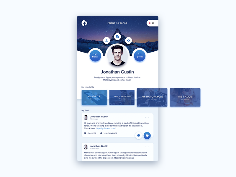
Newsfeed
Credit: Masum Parvej
The main feature to notice in this redesign is the introduction of a second column in the News feed. This is a departure from many of the other concepts that tend to direct focus toward as few pieces of content as possible. But, this does the opposite. Masum Parvej suggests that this design might provide a more intuitive experience for both casual users, as well as those who use Facebook for business.
Mobile Messenger

Credit: Sahil Vohra
Sahil Vhora proposes a subtle material update with his mobile redesign. The architecture of the interface remains the same, but Sahil uses the redesign as an opportunity to try out some different icons and give Facebook’s color a refresh.
Artist’s Page

Credit: Ramil Derogongun
Ramil Derogongun imagines this concept for an artist’s page and embedded music player. Derogongon keeps the interface simple by doubling up on objects such as the track player beneath the song title. This redesign was popular enough to earn a few rebounds also.
What would you change about Facebook?
These examples are great, but we would like to see what else our readers can come up with. We are giving two weeks from today – Nov. 29 – for you to comment on this post with a link to your Facebook redesign. The top design will earn a Dribbble invite, a Toptal t-shirt, and $200 to Creative Market. We will announce the winner on Friday, Dec, 2. Comment with your submission below!
No comments:
Post a Comment